CLINICAL TRIAL EXECUTION PLATFORM

The platform for highly complex, sample-intensive clinical trials

Notifications

Notifications

Role:

Role:

Role:

Product Designer

Product Designer

Product Designer

Tools:

Tools:

Tools:

Figma, Miro, Typeform

Figma, Miro, Typeform

Figma, Miro, Typeform

CONTEXT

As a product designer, I was responsible for improving the user interface (UI) of a proposed notifications feature. Initially, the feature, developed by the engineering team, was functional but bare-bones. Additionally, our existing Alert system seemed to overlap with the new notifications feature. This raised questions about its necessity, the potential for confusion between alerts and notifications, and whether a notification system would actually solve the problem.

As a product designer, I was responsible for improving the user interface (UI) of a proposed notifications feature. Initially, the feature, developed by the engineering team, was functional but bare-bones. Additionally, our existing Alert system seemed to overlap with the new notifications feature. This raised questions about its necessity, the potential for confusion between alerts and notifications, and whether a notification system would actually solve the problem.

DESIGN PROCESS

Understand

Define

Ideate

Prototype

Test

PROBLEM

Too many alerts = users are overwhelmed. One common complaint about the alerts feature is that Slope generates a f**k ton of them.

Too many alerts = users are overwhelmed. One common complaint about the alerts feature is that Slope generates a f**k ton of them.

144

144

Expiring

Expiring

324

324

No/Low Inventory

No/Low Inventory

156

156

Expired

Expired

RESEARCH GOAL

Understand which alerts are crucial for users to receive in real-time versus those that are helpful but not time-sensitive, so that we can optimize the alert system to better match user needs and reduce notification fatigue.

Understand which alerts are crucial for users to receive in real-time versus those that are helpful but not time-sensitive, so that we can optimize the alert system to better match user needs and reduce notification fatigue.

PREWORK

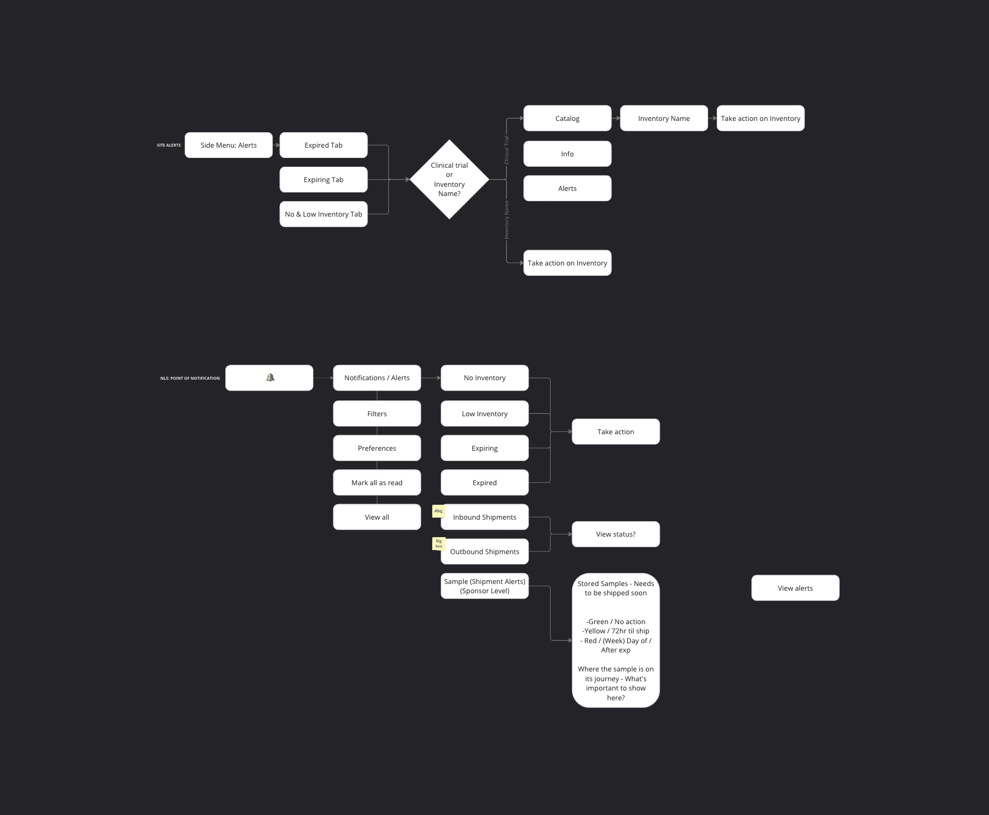
Prior to beginning the research, it was necessary for me to comprehend the function of Alerts, including when users receive notifications and what actions can be taken in response to these alerts.

WHAT USERS DO

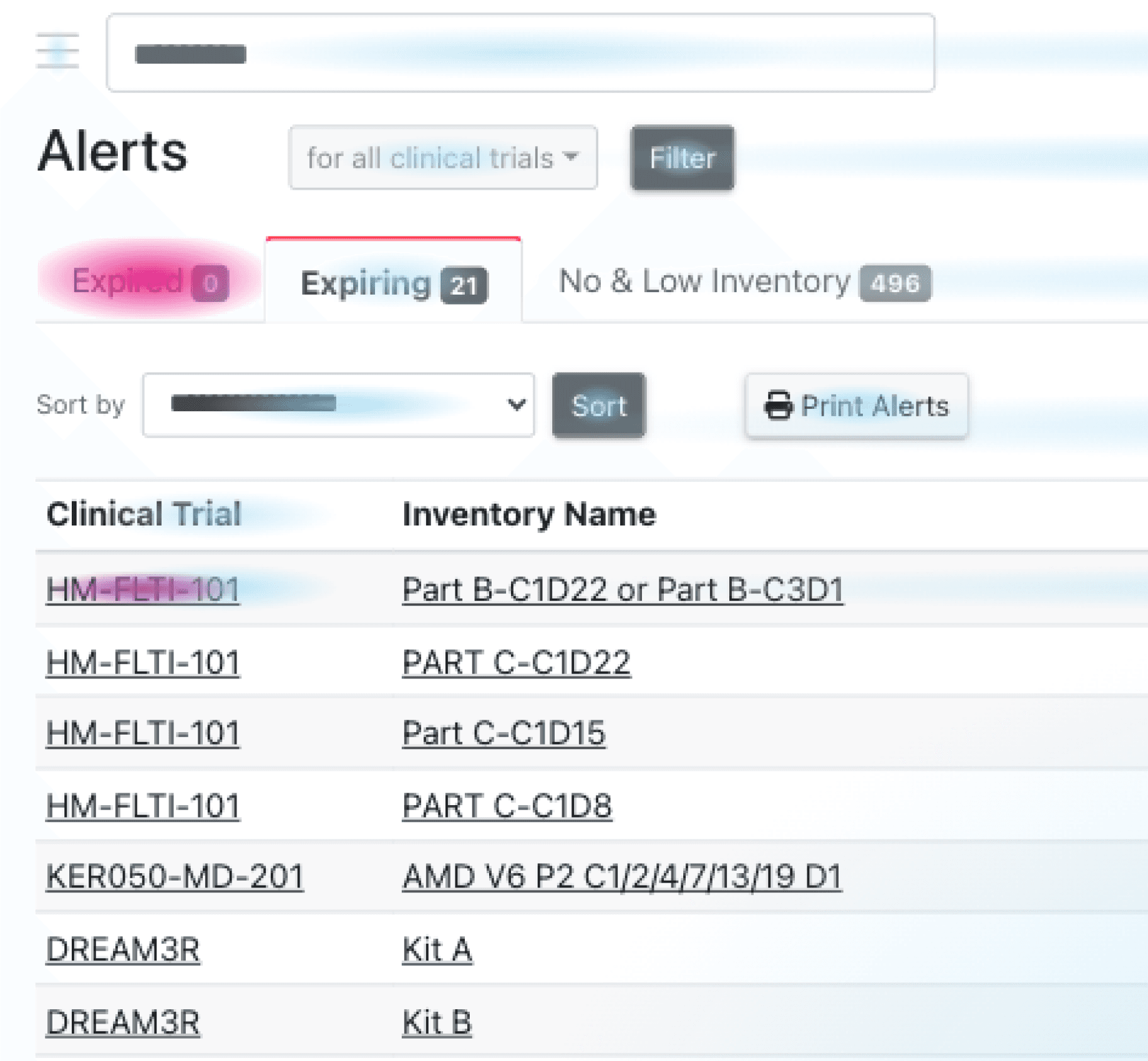
Users frequently clicked on expired and soon-to-expire inventory items. Many also appeared confused about how to clear alerts, often navigating to clinical trials before returning to click on the inventory name.

WHAT USERS SAY

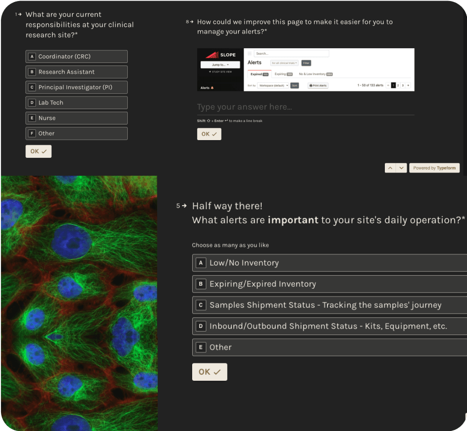
I created a survey to better understand our research goals. The survey revealed that different types of users interact with alerts in various ways. This provides an opportunity to distinguish between alerts and notifications and to offer users more control over what they see, as well as when and where they see it.

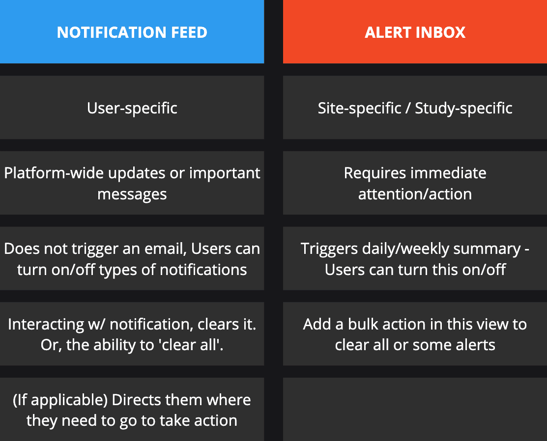
NOTIFICATIONS VS. ALERTS

I needed to clearly distinguish and define what triggers a notification versus an alert. To do this I held a workshop with ClinOps, Engineers, and Stakeholders to brainstorm potential use cases for each user.

1ST NOTIFICATION CONCEPT
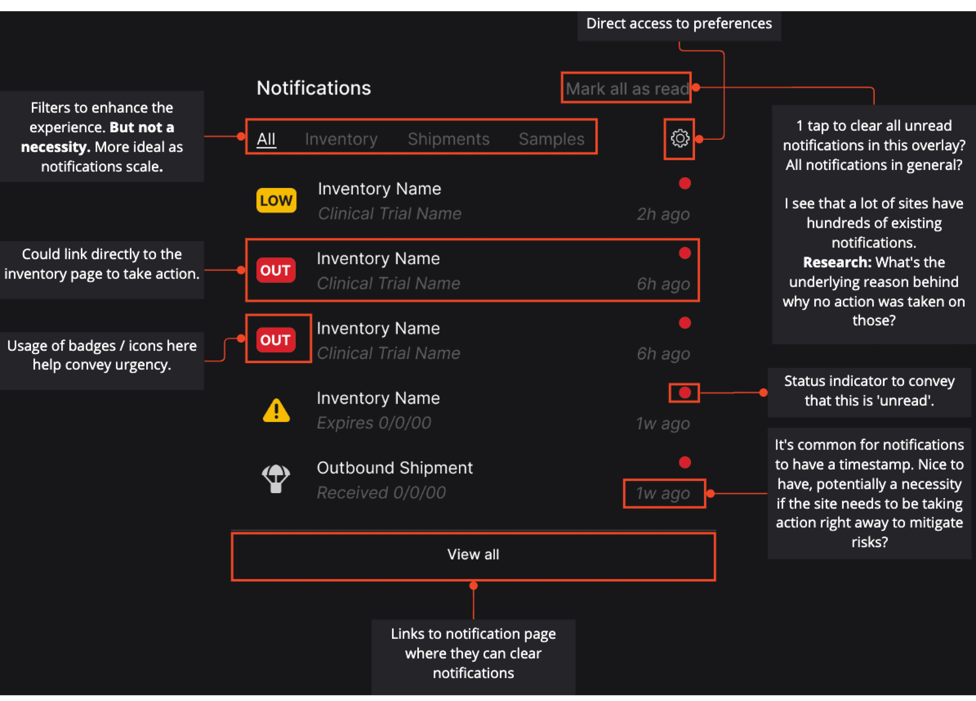
TESTER FEEDBACK

“I would view and take additional steps after looking at that. Start ordering inventory that came up low, and making sure that what I am out of KIT wise, has been ordered and to look where that is in getting to my site. I would't use the outbound shipment tool for anything, never have used it for this here in research at my site. I have other paper and electronic logs for that.”

9

9

Concepts

Concepts

6

6

Prototypes

Prototypes

3

3

Proposals

Proposals

POST-DESIGNS AND PROTOTYPES

After quickly developing various concepts and prototypes, I suggested that we first improve the existing Alerts page before introducing Notifications. This decision was based on the need for further exploration to fully optimize notifications for all user types. Our current infrastructure is complex and has many inconsistencies. Instead of risking a complete system overhaul, we should start with manageable improvements. Over time, these changes will guide us to our goal, as we monitor performance and behavior patterns following each modification:

After quickly developing various concepts and prototypes, I suggested that we first improve the existing Alerts page before introducing Notifications. This decision was based on the need for further exploration to fully optimize notifications for all user types. Our current infrastructure is complex and has many inconsistencies. Instead of risking a complete system overhaul, we should start with manageable improvements. Over time, these changes will guide us to our goal, as we monitor performance and behavior patterns following each modification:

RELEASE 1

Replace the existing table with 'turbo' tables to achieve consistency across pages. This update will enable users to select and act on multiple items in bulk directly from this page, eliminating the need to click into and return from each list item individually.

RELEASE 2

Recognizing that most users manage hundreds of inventory items we’ll introduce advanced filtering and search capabilities within the tables, enabling efficient navigation across multiple pages. This improvement aims to eliminate the need for users to remember specific page numbers and reduces waiting times for page loads, thereby streamlining the user journey and enhancing overall interaction efficiency.

RELEASE 3

Give users control over what types of alerts they receive versus those they don’t and where (platform vs email).